Someone’s already put Fairytale of New York on in the office, and arguments are breaking out about the use of a certain word. The tubs of Celebrations have appeared, and scornful looks are being passed to the person who grabbed all the premium chocolates (Cough.. James) and left you with nothing but bounties. But within all this chaos… Every child in a 20-mile radius wants to know one thing:
“Where’s Santa right now?”
The answer, of course, is: online, like everything else…
Santa websites are a weirdly brilliant corner of the internet. Huge traffic spikes every December. Ridiculous amounts of dev work for something that is “live” for about three weeks. Tracking dashboards for a fictional man in a flying sleigh.
We have gone digging through the festive web again for 2025. Here are the Santa sites actually worth sending to your kids, your niece, your overly-committed Christmas colleague, or your own inner eight-year-old.
1. NORAD Tracks Santa: Mission Control For Christmas Eve
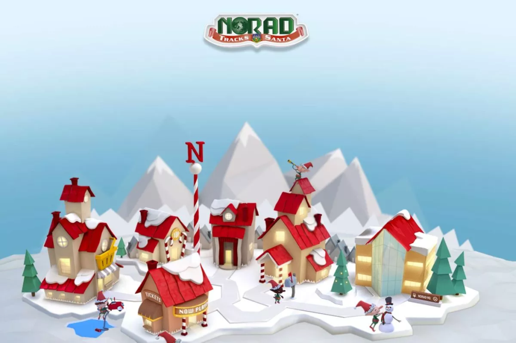
If Santa had a ground team, it would look like NORAD.
NORAD Tracks Santa is run by the North American Aerospace Defence Command. Yes, a literal military organisation with radar, satellites, jets, the lot. They put all of that behind a delightfully retro Santa tracker that goes live every December.
What you get:
- A real-time map of Santa’s route on Christmas Eve
- “Sightings” as he passes cities around the world
- A countdown to launch, games and videos in the run-up
- Voice updates if you use the phone line or smart speakers
Design-wise, it feels a bit like a Cold War control room that someone sprinkled with glitter. That tension is what makes it fun. Kids get the excitement of watching Santa “blip” across the screen. Adults quietly enjoy the idea of defence infrastructure tracking a red sleigh.
From a UX point of view, it is a tidy example of taking very serious tech and wrapping it in an extremely silly story.
2. Google Santa Tracker: Elf Village Meets Product Playground
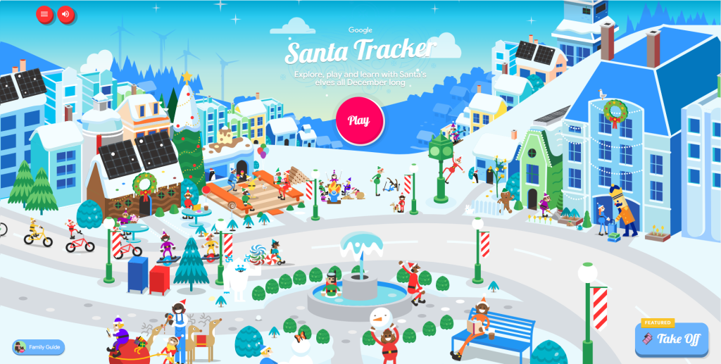
If NORAD is mission control, Google Santa Tracker is the Christmas theme park.
Head to the site in December and you drop into a fully animated “Santa’s Village”. Every building is a mini experience: games, code labs, geography quizzes, silly videos, traditions from around the world.
What you get:
- Dozens of quick little games for kids
- Coding activities that sneak STEM learning into Christmas
- A full tracking map on Christmas Eve with stats, distance and presents delivered
- Teacher resources and lesson-style activities
The whole thing feels like it came straight out of Google’s internal playground. Clean motion design. Excellent microcopy. Consistent visual language across dozens of mini apps.
Under the hood it is doing what Google does best; turning a simple search intent (“Santa tracker”) into an ecosystem that keeps you exploring, sharing and coming back.
3. EmailSanta.com: The Chaotic Old-School North Pole Hub
EmailSanta.com is what happens when you never stop adding Christmas features.
This site has been around since the late nineties, and you can tell. The aesthetic sits firmly in “early internet”, but that definitely ends up being part of the charm.
What you get:
- Write a letter to Santa and get an instant reply
- “Naughty or Nice” checks with gloriously dramatic outputs
- Santa webcams, reindeer cams and Rudolph’s “nose cam”
- Jokes, trivia, games, pet letters to Rudolph
- A Santa tracker and countdown features that feel straight out of a kids’ TV special
The navigation reads like the inside of a child’s brain on Christmas Eve. New thing. Another new thing. Something with reindeer. A game. A list. A camera. It should be absolute chaos. Somehow it works.
From a content strategy perspective, EmailSanta is a fascinating case study in depth. There is always one more click, one more little feature. Engagement through sheer volume and variety.
4. Portable North Pole: Hyper-Personal Santa Videos
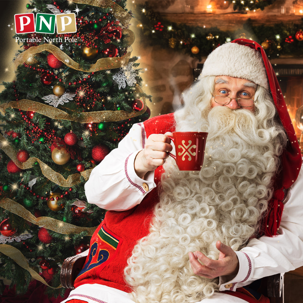
Portable North Pole (PNP) does one thing very, very well; personalised video messages from Santa.
You answer a few questions about the recipient: name, age, where they live, a couple of achievements, and one or two wishlist items. PNP then stitches that into a custom video featuring Santa talking directly to them.
What you get:
- Free personalised video messages to test the magic
- Paid upgrades for longer videos and more elaborate scenarios
- “Live call from Santa” experiences
- Variations for toddlers, older kids, siblings, even grown-ups and work teams
The production quality is high. Sets, costumes, props; it all feels like a Netflix Christmas film. The personalisation layer gives the illusion that Santa sat down and recorded that piece just for you.
From a digital perspective, PNP is a polished example of templated video automation. Structured inputs in; highly emotional output out. Also a masterclass in how to layer a freemium model on top of a “pure magic” product without killing the vibe.
5. Northpole.com: Vintage North Pole CD-ROM Energy
Northpole.com has been on the internet longer than some marketers; it’s actually only a few years younger than me, so it is older than my trainee at least.
This is one of the original Santa “destination” sites. It leans into full cosy storybook mode: snow everywhere, wooden signs, twinkly lights, the lot. Each area of the “village” opens up a different activity.
What you get:
- Write to Santa and pick up your reply later from the Mailroom
- Personalised stories where your child becomes the main character
- Craft ideas, recipes and printable activities
- Teacher resources for turning the site into classroom material
Visually, it feels like firing up an old PC game on Christmas morning. Big buttons. Simple interactions. Very little concern for modern minimalism.
Underneath that aesthetic sits a very clear content model. Children, parents and teachers each have dedicated journeys. It all still feels like one place. That is not easy to pull off.
Honourable Mentions: The “Who Is Santa Really?” Sites: St Nicholas Center & WhyChristmas
At some point a bright kid will ask awkward questions about Santa. This is where the more educational side of the Christmas web comes in.
Two sites worth bookmarking:
- St. Nicholas Center: Focuses on the historical Saint Nicholas and how that evolved into Santa. Stories, traditions, activities, church resources and a “for kids” area.
- WhyChristmas.com: A huge information site run out of the UK; covers Christmas traditions, “Christmas around the world”, the Christmas story, games, an Advent calendar and a very busy Q&A section.
Both sites walk a neat line. They give you language and resources to talk about Santa, history, religion and tradition without going full “spoilsport”. Useful for parents who want more than cartoons, and for teachers who need to stretch one Christmas lesson into three.
From a UX and content angle, they show how to handle sensitive, slightly messy topics in a way that stays friendly and accessible.
What These Santa Sites Get Right (And What Brands Can Steal)
Strip away the tinsel and these projects behave like very good digital products.
They tend to share a few traits:
- One clear promise
Track the sleigh. Send a letter. Get a video. Learn where Santa came from. Each site has a primary job, and everything else supports it. - Layered experiences
You can dip in for a quick interaction or stay for half an hour. There’s always another game, another story, another little tool. That keeps people exploring. - Consistent worlds
NORAD uses the “serious control room” frame. Google builds a whole elf-run town. EmailSanta lives in a noisy newsroom at the North Pole. The story drives every design decision. - Smuggled-in learning
Geography, coding, reading practice, history, and charity. Most of these sites sneak some learning in under the wrapping paper.
If you are planning any seasonal campaign or an “always-on” brand experience, these are good reference points. Strong hook. Tight story. Clear UX. Enough depth to become a tradition.
Santa might only clock in properly once a year, but the best Santa sites earn repeat visits every December. That is the real magic trick.